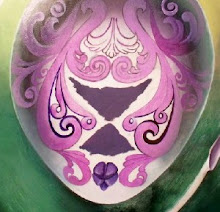
I transferred the most recent "spider drawing" to the 24 x 48 inch panel, and then began thinking about the background.
There are several options.
The easiest to draw and paint would be to airbrush a simple, slightly out-of-focus "interiour" scene, like the upper "corner" of a bedroom or living room or kitchen--the place whe the walls meet the ceiling--where spiders like to love.
You'd see part of a doorframe, maybe the top of a window, and some light and shadow.
Simple, direct. Easy.
But is that "good enough"?
Unsure, I began sketching further, and came up with [the start of] a VERY complex, elaborate background--along the lines of the science fiction backgrounds I created for my paintings from ten, twenty years ago. It's far enough removed from everyday "reality" that it could appear huge--something I like, because the spider could then be seen as being very large, too--or, small and hanging in its web in front of a very broad, expansive background.
Cool (at least cool-looking, to be sure) but not exactly what I want.
Pretty--but, ultimately, rather empty. Now, I like eye-candy as much as the next artist, but while I want my work to be visually pleasing, I want it to mean something, too.
And, I want the spiders to be seen as "observers"; I see them as watching humanity--but not understanding us, any more than we understand them. Perhaps, they're not actually observers, but simply inhabit--uncomprehending, unconcerned--as human beings, "superimposed" on "our" world.
Hmmm...
Maybe a simpler background is all that is necessary, to convey something along those lines.
Since I intend to use the airbrush--a lot--on this piece, anyway, this background would be relatively easy to airbrush, and look good.
I think I just talked myself into it!
Progress photos coming soon...
06 July 2013
Subscribe to:
Post Comments (Atom)

No comments:
Post a Comment